1. The following events are portrayed by a professional with many years of experience with technological incompetency. You techie Facetwitter kids, don’t try this at home. Please. My pride depends on it.
2. In case you haven’t noticed, things look a bit different around here. Yes, I think it looks great. No, I did not do it myself. But I’m flattered nonetheless that you would think so. Right? Of course.
3. Once upon a time, there was a beautiful princess with a food blog who was determined to do all of the graphic design herself.
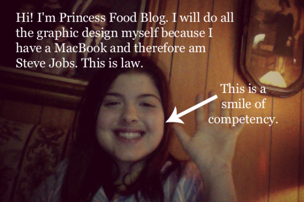
I can do it, she said. It will be fun, she said. I am Steve Jobs, she said. I have crown, she said.
…sure.
As a disclaimer, I do totally have a crown. It’s made of real gold paint and everything. And yes, I am the legitimate princess of a small principality located in the south-western portion of the North American continent (commonly referred to by the public as Southern California) and is called Mybedroomtopia. Behold my throne and the great power I wield. (I can’t get my dog to bow to me… yet.)
4. Once upon a time at one in the morning last May, I commanded my advisory cabinet and army (MacBook and PicMonkey) to conjure up this beautiful graphic design. I went to sleep all proud of my royal self. As the sun shone and the birds sang the next morning, I woke up all bright and alert and saw the design was very, er… colorful.
If you remember it and know what I’m talking about… I know. If you don’t, no I’m not leaving a picture. Remember that ‘my pride’ thing? Yes. Let’s try to keep that intact.
I tell myself I’ll change it. I’ll change it right… tomorrow. Today I need to attend to my royal duties (i.e. I’m hungry).
5. Yes, I hear myself when I talk. I know I had to hire a professional. The problem? I didn’t hire said professional (The BRILLIANT AND AMAZINGLY FANTASTIC Chris Graver) for about, oh, a year. I know. I just… know.
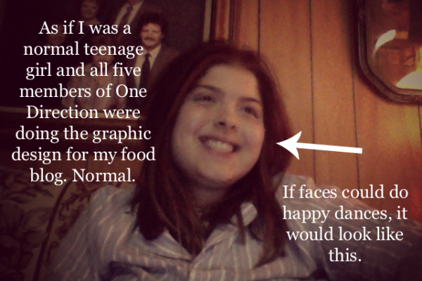
Hiring a graphic designer was a huge deal for me, so when I knew I found the right one (seriously, this guy is amazing), I looked something like this.
6. This poor man. Little did he know what he was getting himself into. The logo was finished on round 9 (yes, NINE) of edits, and I’ll probably have him change it again before we’re done.
The sheer amount of work involved in overhauling a site is no joke. I’m a pretty sunshiny and rainbowy kind of gal, but when I was categorizing all my recipes, ALL of them… ouch.
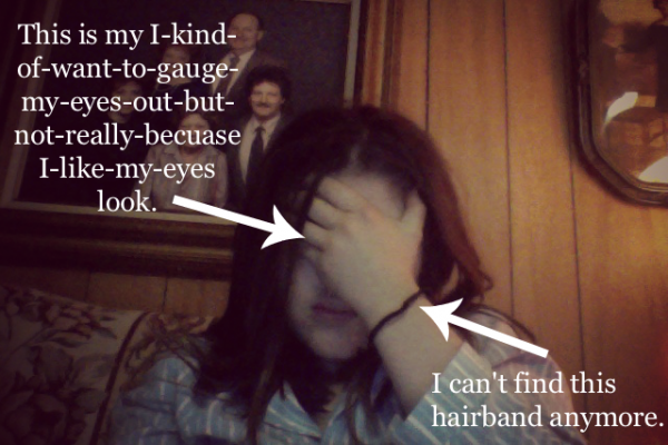
(Side note: I miss that hairband. Now I’m using a rubber band and do not like it as much.)
7. Do you know what HTML stands for? I do!! HyperText Markup Language. Did you know there is no space between Hyper and Text? It’s on the Wikipedia, so it must be true.
8. It gets better. Oh yes. You know what really makes the graphic design process even more enjoyable? Make sure to have your site crash no less than twice in a 36 hour period.
Tech support? Please help. Please.
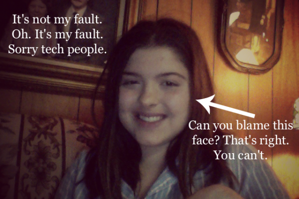
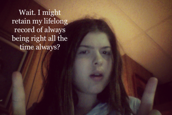
“Wait, the problem seems to be coming from a code in the Thesis theme.”
“Yes ma’am. You’re not at fault here.”
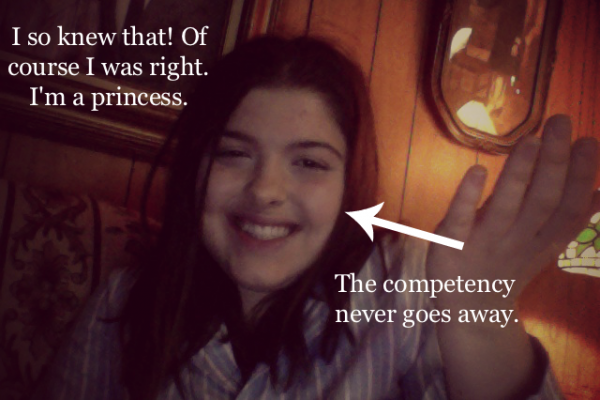
Victory is mine! Take that, non-bowing dog!
9. Did you know that if you write click a page (anywhere! on the page!) you get the pages source code? What a world!
10. I’m awful about changing things. I go in and change fonts, colors, backgrounds (!)… and this Chris magician puts up with me. Heaven bless his soul.
11. And while I’m changing things I simply must have your opinion. MUST! Not optional. Which background do you like better?
The stripes:

vs the newsprint (what’s live now):

Honestly, I’m leaning towards the newsprint. It’s charming, it’s very me, and it shows thought without being too distracting. Plus, if you look closely, it shows easy bicycles and automobiles that were revolutionary in their time… just like I hope to be!
Please let me know what you think!
I should be back tomorrow or the next day with a an actual recipe. With food. Exciting, I know!

 High Protein Double Chocolate Muffins
 Fresh and Easy Baked Taco Shells
 Healthy Ratatouille
 My New Favorite Brownies
 Healthy Almond Butter Fudge
 World’s Healthiest and Easiest Cinnamon Rolls
 Low Carb Peanut Butter Banana Coconut “Granola”
 Healthy Cookie Dough Bites (For Breakfast?!?!?)
Comments